Wednesday, December 18, 2013

An Illustrated Merry Christmas

Well. I have offically been caught up in all the hoopla that this season brings!
There has not been much time for painting this month.  
But I have managed, here and there, to make time for my illustrated family Christmas card.  
I know this is not the type of work you are used to seeing from me but it is a tradition
30 years in the making.
I started these pen and ink illustrations with just my husband and myself when we were first married down to our very grown up children today.

2013
A new family member added this year,  my daughter-in-law, Jenni!
The three angels on the right are for mine and Larry's parents who have passed away.  
They have appeared on the card in this way every year since they've been gone.
The paw prints in the snow and the bone are for our beloved little beagle, Glenn, who was a true member of our family and has been gone now for almost four years.
We adopted him from a rescue and he lived with us for almost 13 years.

And a few from past years.

2009
I often dressed us in Dickens type clothing.  
Sadly, this was Glenn's last appearance as he passed away the following Spring.


2008
Santas Workshop
Can you find Glenn and the Angels?


2007
The Twelve Days of Christmas.  What was I thinking!
It was quite a feat getting it all on an 11" x 17" space but it is fun to look at.


2000


1998


1997 


1995
This was the first Christmas since my Dad passed away.
That's him watching us from the shop window.
This illustration was made for him in honor of a childhood memory. 
My Dad, brother, sisters and I always walked a few blocks away to buy our tree from a city lot.
We then all carried it home together to decorate.


1990
The kids are 3 and 6 years old here.  Where does the time go.

As you can imagine, doing this for 30 years there are alot more but these are my favorites.

After my mother in law passed away we were at her house cleaning up.
A very sad task.  
While going through some things I found a box in which she had saved all the cards
from the first year on.
I have them packed away for safe keeping.

Merry Christmas friends and celebrate a Happy New Year!

Sunday, November 17, 2013

Autumn Jewels

"Autumn Jewwls"
Watercolor
©Carmella Tuliszewski 2013

The morning of our son's wedding my husband and I were up super early.  I don't know if it was excitement or nerves but there we were looking at a long, long morning of waiting to get ready.
We went down to the hotel lobby, grabbed some coffee and sat outside.
What an amzing morning it was!  Perfect weather for an outdoor wedding.
After a awhile Larry started to fall asleep in the rocking chair so i deceided to take a walk with my camera in the Cooperstown very early morning sunshine.

Now you can imagine the multitude of colorful leaves blossoming on an Autumn day in upstate New York, but this branch really stopped me.
Every color from golds to magentas to blues were on this one branch reaching out to the light.

Since this is the first time I have ever painted leaves, I'm sure I have not done nature justice but this little painting will always remind me of that perfect morning.

Tuesday, November 12, 2013

Let's Talk Color! Orange.

Orange can be tricky.  Too bright and it looks brassy.  Too dark and it looks muddy.
So I spent the last month or so making myself work through these spectral deamons.


I don't like working with segmented paint trays unless I need to make very watery washes.
I love my white butcher trays and keep a few going as I work a painting.
For me it makes for easier and more spontaneous mixing.

And, as you can see, I don't worry about keeping a clean edge around the painting.
I test all my color mixes on the outside edges as I go.
A mat will cover all this up anyway and in furture when a collector deceides to change the mat they will find all the research done in the execution of their art.


As an art teacher for many years, I taught Color Theory quite often.
If you are still reading this then I assume you are an artist or someone really interested in the process.
Meaning you probably know all the basics of color theory but here are a few things you may not know.

What does the word HUE mean in the name of some of your watercolor paints?
"Hue" means colour and indicates that a modern pigment has been used instead of the traditional one. For example, 'Cadmium Red Pale Hue' is a 'colour of cadmium red pale'. A hue colour is not necessarily inferior.

Speaking of Cadmiums... did you ever notice that cancer warning on the back of Cadmimn paints?
They can be harmful if used as an inhalant like airbrushing.  But read this resource article from Winsor & Newton for more info.
http://www.winsornewton.com/resource-cente/product-articles/spotlight-on-colour-cadmium-yellow?lang=gb

And how about all those lovely Quinacridones I see artists raving about lately?
Well, they are worth their weight in gold and I am a real fan.  In fact I've put a set made by Daniel Smith on my Christmas list this year.
The Quinacridone family of colors (pronounced kwin ak’ ri doan) are high-performance pigments with outstanding transparency and color intensity. Ranging from pink to purple and gold to sienna, they are lightfast with a clarity traditional pigments cannot match. These modern synthetic colors were created in the 1960s for use in automotive paints, where brilliance and lightfastness are essential.
In the early 1990s, Daniel Smith became the first maker of artists’ paints to introduce a full line of quinacridone colors. Ideal for watercolor painters, quinacridones combine the power of staining pigments with the luminosity of transparent pigments. They produce glowing washes, have incredible depth of color and can be lifted easily while still wet. Understandably, quinacridones have become some of our most sought-after colors.

The above are the color receipes (sorry about the yellowish pic) I most used in my painting
 "Flow Blue".
I also used a variety of blues as a glaze to either darken or quiet down some of the oranges.

My absolute favorite orange right from the tube is Vermilion.  Love it, mixed with other reds and yellows it never fails to deliver a brillant color.

My favorite new color is Quinacridone Gold.  The most georgous color straight from the tube!

A few technical notes.

I usually work on Arches cold pressed blocks which do not require stretching.
Since "Flow Blue" required a larger paper, I had to stretch a 22" x 30" sheet.
It makes a real difference in how the paint plays on the surface.
Soaking and stretching takes some if not all of the sizing off the surface of the paper.
This makes lifting color almost impossible as without the sizing, the paint sinks into the fibers.
But it does give the paint surface this lovely felted look.
Try soaking in cold water for as short a time as possible to help keep some of the sizing.
For my next large painting I will be working on a 300 lb sheet of Arches Cold Press.

Masking can be our friend.
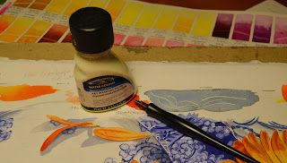
I needed very thin lines on some of the dishes. Winsor & Newton mask and a quill pen works wonderfully!  I love this mask.  It stays liquid longer than others I have used and you can shake the bottle without fear of clumps.

Well, I see we are getting our first snowflkes of the season this morning!
Good day to you!

Thursday, November 7, 2013

Flow Blue and Gerber Dasies- Progressions

Composition is always important when you set out to plan a painting but especially
so when laying out a still life.   I love still lifes.  I love finding interesting objects and
"setting the stage" with props and lighting.
Here I set the stage so that your eye travels with the daisies down through the the scene on the
diagonal to the focal point of the two flowers sitting in the front plate.

These antique flow blue dishes hang in my dining room as a collection I started over 20 years ago.
The design became smudged as the dish was imprinted, hence the name, and making for fun watercolor painting.
They date from about the 1880's to the 1930's.

Now the real fun begins!  Orange and blue are complementary colors and classic together.
Color intensity comes from the color itself and from the colors around it.
But more on colors later.  I tore out some pedals and just let them drop.
I do like the circle on circle design but wanted to break it up some by introducing a new shape.

Now I need to make sure it will look the way I see it in my head by starting details.

Moving along, excited every morning to get back at it.
I love that even though these are all the same variety of flower, they are all so different.


"Autumn Suns",  Watercolor,  18" x 24"
©Carmella Tuliszewski 2013

Next Post- All the fun color receips used on this piece!

Wednesday, October 16, 2013

Jacks

I won't lie, it's been difficult to paint, as much as I love it, after the exciting weekend we had with family and friends at my son's wedding.  But I managed to finish this little piece and it was all I needed to get back in the swing.

Growing up in Philadelphia I enjoyed all the favorite summer pass times a city kid can hope for, such as, bombing the neighbor kids with water balloons, jumping into a full blast open fire hydrant for refreshment and a good round of double dutch.  But I have to say Jacks was my favorite game.
It involved throwing ten of these mental spikes down, letting the ball bounce once as you picked up the required number of jacks and catching the ball before it hit the ground for a second time.  It would start with one and a time (onesies), then two at a time (twosies) all the way up to the super challenging all ten at a time.  I had some scrapings and callouses on the outside of my hand by the end of every summer.
My own well earned badge of honor.  Ahh, good times.

"Twosies"
 Watercolor,  7" x 20"
©Carmella Tuliszewski

I've been wanting to practice painting colored metal in prep for a future painting I have in mind and this was perfect.  The swishy blue lines are meant to symbolize my hand flying down and sweeping up the jacks one after another.

Well now that I'm back at it again, I start a larger painting tomorrow.
Have a good evening!

Friday, September 27, 2013

Mini Pumpkins

Orange and red have always been difficult for me to use in watercolor.  Not sure why.  They just are never as bright as I'd like them to be or difficult to darken without getting that muddy, grainy look.
So I was determined to get better at it with some extra practice and I figured a few things out.

I never use any browns right out of the tube.  Seems to be the kiss of death to a fresh looking painting.
I make all my browns by combining many variations of the three primary colors.
I also make most of my own greens for the same reason.

An even better way to darken an area is to use the complimentary color.  In this painting I glazed with different blues over the oranges to get the darker areas of the pumbkins and candy corn.

"Blue and Gold", Watercolor, 10" x 15"
©Carmella Tuliszewski 2013

This is another fabric piece from my propt basket.  The lining up of the design so that it looks like it is going back in the distance is a trick of perspective.

Here is a little interactive tutorial on drawing a pattern in 1pt. perspective.
http://juliannakunstler.com/art1_1pt_ch_board.html#.UkXlkhaCCJU

That's what I did here except the design staggers a half step in the repeat on every other row.
After the drawing was done I washed the lighter blue across, let that dry completely and began painting in the design with the darker blue.  Sounds a little crazy but I love doing those kind of details.
With a drink (non-alcholic!) and some good music it goes fast.

When I taught middle school art one of my favorite artists was Matisse.
I became pretty obsessed with him.  Read all the bios and stared for uncomfortably long periods of time at his work in museums.  And ever since I have just loved combining patterned fabric in my still lifes.

Here are some past still lifes of mine which incorporate patterns as a base.
"Cradled Lemons"

"Family Jewels"

"Fabricated Swim"

"Hearts Alight"

"Paisley Pumpkins"

Well I've gone on a lot longer here than I intended!
Thanks for taking the time to view my work.

Saturday, September 21, 2013

Paisley Pumpkins Tweeked

When I finish a painting it goes up on my board so that I can check it for possible improvements.
Don't get me wrong I do love this painting but there was something...  Too bright, too high key or maybe the shadows are too strong?  I deceided it was all that so the tweeking began.

Here's the original version.


And here's the revision


See the difference?  A softer, gentler version that's a little easier on the eyes.
What do you think?

Friday, September 20, 2013

"Paisley Pumpkins"

I keep a prop basket filled with interesting fabrics I find in kitchen shops, thrift stores and of course fabric shops.  This paisley pattern has been in that basket for a long time.  I needed a set up that could hold it's own to this complex, insanely colorful pattern.  I found it in the pumpkin.

This still life is set up in the bright afternoon sun because this feels most like Autumn to me.  I painted the pattern first using a concentrated watercolor that is more staining than other paints.  This means, first, I better not make a mistake and secondly the colors will not wash away when the shadow is glazed over it.  The pumpkins are back to my favorite Winsor & Newton watercolors using all from bright yellows to a mix of various oranges and blues for the modeling of the darker areas.


"Paisley Pumpkins"
Watercolor, 9 1/2" x 14"
©Carmella Tuliszewski 2013


So how to start that paisley pattern drawing?
I taught middle school art for ten years and this is what I told my kids when a complex drawing project began.
"Draw what you see not what you assume you see.  Find a starting point and draw that first shape as perfectly as you can.  Now it all builds from this one perfect shape.  It's all about the relationship of one shape to another- how close is the second shape to the first?  Where does it touch the first shape?  Judge your sizing by that first shape, is it smaller or larger."

Practice what you preach, right?  
I kept all this in mind as I started this pattern.
This weekend is the Autumn Equinox.
A favorite time of year for me and I may have one more pumpkin painting in me before it's over.

Thanks for stopping by!

"Paisley Pumpkins" is available for purchase from my website.


Friday, September 13, 2013

Opal is for October

The name Opal derives from the Greek Opallos, meaning "to see a change of color." 
An Opal's beauty is the product of contrast between its color play and its background.
Opal is a formation of non-cryatalline silica gel that seeped into crevices in the sedimentary strata.
Through time and nature's heating and molding processes, the gel hardened into the form of Opals.  The Opal is composed of particles closely packed in spherical arrangements.  When packed together in a regular pattern, a three-dimensional array of spaces are created that give the Opal its radiance

The American Gem Society

The lantana flower.
When I first read the description of the Opal I instantly thought of the Lantana.  I have many growing in my own gardens and love the different colors of small flowers displayed within one blossom.
How perfect this tiny flower is to represent the Opal.  And how perfect that a birth stone whose name means "a change in color" is the stone for the month of October, when the world transforms in front of us all month with the change of seasons.

The symbolic meaning of the Lantana is generally associated with rigor.  
Victorian bouquets often contained Lantana as a secret message of a tryst between lovers.

"Opal"  October
Watercolor, 8" x 10"
©Carmella Tuliszewski 2013

The greens of the leaves set off all the brillant colors really well.  The sun gently shines down on the scene, leaving a softly ethereal shadow on each blossom.
This is a wonderful start to the Autumn season, my all time favorite time of year!

You may purchase "Opal" original painting or a Giclee Print from my website under 
"Portfolio of Works"
http://carmellatuliszewskiart.com

Have a happy weekend!

Friday, September 6, 2013

Do Over Day

I worked on a new Gem yesterday but it just wasn't right.  
It may have been that I saturated the color too soon and set the whole thing off to a bad place.
I knew I was in trouble when I started using white qouache in an attempt to rescue it.
Watercolor shines when the white of the paper shows through and the colors feel fresh and real.
And thats just one of the things that make it a difficult medium to work with.
I'm still learning ways, means and a few tricks!

Before I totally gave up on it I did some scrubbing out.


Now this usually works so long as you don't get carried away.
Scrubbing out is tough on even the best of watercolor papers.  It leaves the surface scratched and the fibers broken.  This can drastically change the value of the color as you repaint the area.
So I have a little trick with a spoon that really works.

After the area is totally dry, take the back of a spoon and gently message the area in a circuliar motion.
After a while the surface will feel mended and smooth.  Still a little tricky to paint over but much better.

Well, I am starting over this morning and already think I'm on the right track this time.
I hope your day goes well and happy weekend!


Tuesday, September 3, 2013

A Diamond for April

As the April birthstone, diamonds are the ideal gift for a loved one. And now you have more choices than ever. Get creative and give the ultimate gift of beauty: a fancy-color diamond. 

Fancy-color diamonds are natural, rare and truly exotic gem of the earth. Diamonds in hues of yellow, red, pink, blue, and green range in intensity from faint to vivid and generally the more saturated the color, the higher the value. In fact, diamonds sparkling with intense color are rare and may be priced higher than a colorless diamond of equal size. 

The American Gem Society

As you may know I am a full on, in your face blast of color kind of watercolorist.
So you can understand why I have left gems like the Diamond and the Pearl for near to last in this series.  

However, i think I found the best solution for this gem in the white chrysanthum.
I choose a straight on composition with strong lighting in hopes of capturing the faceted characteristics of this "girls best friend" gem.  Also, finding this description above from the American Gem Society allowed me a little artistic play in the painting.

Here you see brightness and shadowing in hues of yellow, rose, violet and blues.  So it allows me the color I love but stays true to the gem it represents.  The dark background lets the white of the paper really shine through and gives a glow to the work that I was hoping for.

The original painting and Giclee prints are available only through my website

CarmellaTuliszewskiArt.com

"Diamond" (April), Watercolor, 8" x 10"
©Carmella Tuliszewski 2013


Monday, September 2, 2013

Packing & Shipping a Large Framed Painting

So you work and study and work again just hoping to get into your first big show.  
The day arrives for the acceptance list to be published.  And there it is, YOUR NAME!  
Happy dance time!  So now what?
Well if the show is many miles away you will have to prep it and ship it.  But how do you do this and just who do you entrust your baby with to get it there safely?

Now I have shipped paintings before, as large as 20" x 20" but they were backed and matted and not so diffilcut to deal with.  But this was my first large fully framed piece.  So I thought I'd share how I managed this brave new world of shipping precious cargo.

Before I left for vacation I shipped off my painting for the Pennsylvania Watercolor Society Show.
Framed it measured 24" x 30".  I order my boards in bulk and cut my own foam board backing and beveled edged mats, saves a ton of money.  Years ago I bought a Logan Compact Mat Cutter.  Super easy to use and worth it's weight in gold.

Here's a short instructional video if you happen to be in the market for one.

I also order pre-made wood frames from Dick Blick but instead of using the clip board backing that comes with it I like to make it more presentable by using a point driver to attach foam board and I then cover up the back with heavy brown kraft paper and double sided tape.
With the eyelets and heavy wire attached I'm ready to ship.

I did a lot of research for containers for my painting and deceided on Master Pack.
visit their website here
http://www.masterpak-usa.com/masterpak.htm

The box needed to be reusable for the gallery to send back to me at the end of the show. 
(Unless it sells during the show which would be Happy Dance time again!)

You see here that I have cut out the size of my framed art in the center of the foam so that it is buffered on all sides.  Very Easy.


Here my painting sits cushioned on all sides and in a bed of foam underneath and on top.
I close it up, with clear packing tape, two pieces on each of the three open sides and off to the shipper.

I chose UPS.  They were very helpful and I have already checked tracking and know my painting arrived at the gallery and was signed by Bob at the front desk. (Thanks Bob!)

The Pa Watercolor Society had very specific instructions about framing and what they would not accept in the shipping process (no peanuts! and of course not glass.)

Wondering what all this costs?  Well, it's not cheap. The box was about $80.00 and shipping was $112.00 round trip (you have to include prepaid return postage in your shipment.)
So is it worth it?
Heck Yeah!  
It's an honor to be included with so many fabulous artists from around the world.
It's also great exposure and credentials.
But it's something to think about as you enter these shows.

I hope this is helpful to anyone who needs to ship a large important package.

Now the Philadelphia Watercolor Society Show is nearby so I will be hand delivering that this Saturday.
I'll let you know how that goes also.

Friday, August 23, 2013

Pinocchios Done


Carlo Lorenzini was born in Florence in 1820, of humble parents. 
One day, he wrote, he met in the street an urchin who made a deep impression on him: this boy was to be the inspiration for "Pinocchio." 

 He took the pseudonym of Collodi from the village of Collodi (near Pescia, in Tuscany) where his beloved mother was born. He never married and never had children.

In 1881, Collodi wrote a story for "Il giornalino dei bambini." He was in urgent need of money, and his "Pinocchio" was born out of inspiration and out of necessity. In sending in the story, Collodi wrote to the editor: "Ti mando questa bambinata, fanne quello che ti pare, ma se me la strappi, pagamela bene, per farmi venire la voglia di seguitarla." (I am sending you this children's piece. Do with it what you see fit. But if you snatch it up, pay it well, so that I will feel like continuing it.) The story was called "Avventure di un burattino," the adventures of a puppet.

My "Pinocchios" are also from Florence, Italy.  These little wooden toys are sold all over the tourists spots around Rome and Florence.  There is even an all Pinocchios store in Florence.
A magical place for so many reasons.  I must return someday!

"Pinocchios", Watercolor, 13" x 16"
©Carmella Tuliszewski 2013


What fun this was!  I will have to try some other toys in the future.
Related Posts Plugin for WordPress, Blogger...