Orange can be tricky. Too bright and it looks brassy. Too dark and it looks muddy.
So I spent the last month or so making myself work through these spectral deamons.
I don't like working with segmented paint trays unless I need to make very watery washes.
I love my white butcher trays and keep a few going as I work a painting.
For me it makes for easier and more spontaneous mixing.
And, as you can see, I don't worry about keeping a clean edge around the painting.
I test all my color mixes on the outside edges as I go.
A mat will cover all this up anyway and in furture when a collector deceides to change the mat they will find all the research done in the execution of their art.
As an art teacher for many years, I taught Color Theory quite often.
If you are still reading this then I assume you are an artist or someone really interested in the process.
Meaning you probably know all the basics of color theory but here are a few things you may not know.
What does the word HUE mean in the name of some of your watercolor paints?
"Hue" means colour and indicates that a modern pigment has been used instead of the traditional one. For example, 'Cadmium Red Pale Hue' is a 'colour of cadmium red pale'. A hue colour is not necessarily inferior.
Speaking of Cadmiums... did you ever notice that cancer warning on the back of Cadmimn paints?
They can be harmful if used as an inhalant like airbrushing. But read this resource article from Winsor & Newton for more info.
http://www.winsornewton.com/resource-cente/product-articles/spotlight-on-colour-cadmium-yellow?lang=gb
And how about all those lovely Quinacridones I see artists raving about lately?
Well, they are worth their weight in gold and I am a real fan. In fact I've put a set made by Daniel Smith on my Christmas list this year.
The Quinacridone family of colors (pronounced kwin ak’ ri doan) are high-performance pigments with outstanding transparency and color intensity. Ranging from pink to purple and gold to sienna, they are lightfast with a clarity traditional pigments cannot match. These modern synthetic colors were created in the 1960s for use in automotive paints, where brilliance and lightfastness are essential.
In the early 1990s, Daniel Smith became the first maker of artists’ paints to introduce a full line of quinacridone colors. Ideal for watercolor painters, quinacridones combine the power of staining pigments with the luminosity of transparent pigments. They produce glowing washes, have incredible depth of color and can be lifted easily while still wet. Understandably, quinacridones have become some of our most sought-after colors.
The above are the color receipes (sorry about the yellowish pic) I most used in my painting
"Flow Blue".
"Flow Blue".
I also used a variety of blues as a glaze to either darken or quiet down some of the oranges.
My absolute favorite orange right from the tube is Vermilion. Love it, mixed with other reds and yellows it never fails to deliver a brillant color.
My favorite new color is Quinacridone Gold. The most georgous color straight from the tube!
A few technical notes.
I usually work on Arches cold pressed blocks which do not require stretching.
Since "Flow Blue" required a larger paper, I had to stretch a 22" x 30" sheet.
It makes a real difference in how the paint plays on the surface.
Soaking and stretching takes some if not all of the sizing off the surface of the paper.
This makes lifting color almost impossible as without the sizing, the paint sinks into the fibers.
But it does give the paint surface this lovely felted look.
Try soaking in cold water for as short a time as possible to help keep some of the sizing.
For my next large painting I will be working on a 300 lb sheet of Arches Cold Press.
Try soaking in cold water for as short a time as possible to help keep some of the sizing.
For my next large painting I will be working on a 300 lb sheet of Arches Cold Press.
Masking can be our friend.
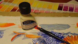
I needed very thin lines on some of the dishes. Winsor & Newton mask and a quill pen works wonderfully! I love this mask. It stays liquid longer than others I have used and you can shake the bottle without fear of clumps.
Well, I see we are getting our first snowflkes of the season this morning!
Good day to you!
Well, I see we are getting our first snowflkes of the season this morning!
Good day to you!


Great information about orange, hues and watercolor stuff!! Thank you Carmella, your an inspiration!
ReplyDelete