Tuesday, September 8, 2015

Suminagashi Paintings

This style of painting has been a good exercise for me.
These are painted with no drawing underneath.
And as an artist who always begins a piece with a very detailed drawing as my understructure this approach strengthened my perceptions of space and form.

The shapes are loosely painted in first followed by the quick brush pen work.


I'm not crazy about the composition on this one, especially in the top center.
But if I'm going to do this I should show you the good with the not so good.
I do like the color and overall feel of it, so that's something.


A fun little series!


Friday, September 4, 2015

Suminagashi Paintings


So some time ago I used my Suminagashi Papers as a back board to 
mount printed postcards of a few of my flower paintings.  I hand trimed in 
gold metallic paint and sold them as a set on ETSY.


I have just put them up on my website to be sold in a group of four in my MUSINGS section.
They each measure 8" x 10" and are ready for your standard size frame.

And now to present time.
 Here's my first try.
Nice enough little drawing but just didnt feel right for this project.

In a teacher reflective moment I thought if I were guiding my students in this what would I tell them?
I would want to support the Objectives in the lesson.
Japanese paper marbling should continue with an oriental style painting.


This is what I came up with and I think I like it.
A loose, quick brush application followed by equally quick
brush pen work.  

Not my style for sure but fun.

I'll be back with a few more of these.
I think I need more practice.

Have a great holiday weekend!


Thursday, September 3, 2015

Suminagashi


Suminagashi, meaning floating ink, is the Japanese art of paper marbling.
I always held this project out as the last of the year to offer my middle schoolers for good behavior.

Here is my set up.
The box of inks can be purchased from Dick Blick.
You cannot use just any paper. 
This is printmaking paper called Copperplate, that is made without sizing.
For those of you who are unfamiliar with the term Sizing.
It is a coating agent applied to papers and fabrics to make the fibers stronger and less absorbent.
Unsized papers allow the surface to quickly take in the liquid applied to them.
These papers can also can be found at Dick Blick, 
but any printmaking papers that have not been sized will work.

A shallow, clean tub of water.
A small amount of inks to start off.
Great colors and of course you can mix for more variety.

Begin with two small brushes, one in each hand, 
dab point of brushes in your color and just kiss the surface of the water with the point of the brush.
Alternate to create concentric circles, then dab around as your little heart desires.

  
Your picture painted on water.


At this point, experiment away by slowly blowing on the water surface or draging the end of your brush through the shapes. whatever you do, slow and easy is the way to go.


Drop your paper in. 
You will begin to see your design through the paper.


Pull out and lay on a clean surface to dry.
I like to pack them between the sheets of a newsprint pad as I work.


You may use newsprint to clean the surface from one design to another.
Here I cut up an old, already read paperback.

And that's it! You will get better as you continue and experiment.
I have done this with papers up to 18" x 24" ( tricky on large sheets so practice a smaller size first)
to create beautiful abstract prints.
They are instantly permanent, brillant color and easy clean up.


So two hours and tons of paper and fun later,
these are my favorites.  
there are so many things you can do with these papers,
make cards, calligraphy quotes over the pattern, cover small sketch books…
How about using some beautiful reds and greens to make 
3D cut paper Christmas ornaments? 
It goes on and on.


But for now I've mounted them on foam core board and 
tommorrow I will see where it takes me.


Wednesday, September 2, 2015

Illuminated Alphabet

Day Two brings a design project.
The Illuminated Alphabet
This was a 7th grade project as part of their Book Arts Unit.
Their works were less complicated than this but beautiful none the less.
Here is the beginning of my new adult version.

 I chose my initial to illustrate in a symmetrical format.


Transfer to paper of your choice.
Here I use a cream colored parchment in keeping with the Medieval theme.
Redefine line work and use a kneaded eraser to pick up any excess graphite.
Now I begin colored pencil values, keeping it light and stylized.


I've completed the colored pencil values, keeping the look light and stylized.
The illumination is added using gold metallic acrylic paint.
Difficult to see here but caught in the light it does illuminate nicely.
Or better yet, gold leaf! but I didnt have any on hand (next time)


The completed art.
8.5" x 11"

Using a Fine Line Sharpie I outline for emphasis and definition.
Of course I could go into this more with detail and values (and I probably will) 
but for the purposes of this quick turnaround challenge, you get the idea.

Now that I've reworked this lesson, I imagine how great this would be as a wedding gift intertwining the two initials.  How about an alphabet series for a childs room or a larger piece spelling out a family name (this time illuminated with gold leaf)
Oh the possibilities!

Here is a shot emphasising the gold illumination.

I did give myself a head start on this one so I could paint on my large waterclor today and tonight.
And I will pop in and share progressions on that over the month.


Tuesday, September 1, 2015

September Challenge

Helloooo September!
This is the part where everyone says things like "Where did the summer go?" or 
"That summer sure did fly by!"  
And I have to confess that I've said it myself the past week or so.
We had a few family functions, traveled a lot and spent some time at the beach with our kids.
But I also have to tell you that I am never really that sorry to see summer go.
Maybe it's my younger school kid self or my former teacher self 
but, to me, September always feels more like a new beginning that January 1st.
I welcome that cool, crisp air coming through my windows and yes even the occasional snow fall.

I begin this "New Year" by taking part in the Leslie Saeta 30/30 Challenge.
Leslie invites artists from around the world to paint 30 paintings in 30 days.
Now I must tell you up front that I have entered this challenge in years past and failed miserably.
Mostly because I am a very slow watercolor painter and a bit of a perfectionist.
Both usually serve me well but not a good combo for this particular challenge.

 So now I am going completely off the rails and heading in a whole new direction.

"Christine"
Mixed Media
8" x 8"

I was an art teacher in grades one through eight for 10 years at a little private school in Philadelphia.
And there were so many projects I worked on with the kids that I thought,
" I must try this as a grown up someday."
So that's my theme, such as it is, to take some of my own kid art lessons and rework them as a grown up, kind of.

The illustration above is my daughter as a little girl (my all time best model).
It is a combination of Gel Medium Transfer, Collage and Acrylic paint.

I will work in this process again over the course of the month and share
the step by steps so that you can try it.
There will also be some printmaking, book arts, oil pastels, collage,
basically all my old teacher bag of tricks.
The idea is not to make a group of masterpieces but to rework some
old ideas as possible jumping off points for other future projects.

I have also started a new large watercolor still life using an iconic kid object as my subject,
of which I will reveal the finish at the end of the month.  I hope.

Yeah I'm pretty sure I'm biting off more than I can chew here.
I hope you will follow along to see if I make it, yikes!
If I miss checking in for a day or two,
don't worry Ill be back, just having a little crazy time.

Any teachers out there following me?
I'll be happy to share my lesson plans, just contact me.


Wednesday, August 19, 2015

Potted Gerbers

I began this painting just before we left for vacation.
It has been a nice work to get back into the swing of painting again.
My painting in summer is always slow but this year even more so.

"Sunbathers"
Watercolor,  10" x 18"
©Carmella Tuliszewski

Another valuable study of light and I had the chance to use a 
new color I aquired while in Seattle.
Shadow Violet by Daniel Smith is a beautiful soft shadow complimenting
a sun drenched scene.  I used it here mostly on the blue and white pot.
Mixed with a bit of Ultramarine Blue it worked great to
give a glow to the shaded area.
Some of the shaded areas of the daisies were also washed over with this same mixture.

"Sunbathers" will be on my website for sale.
Message me that you saw it on my blog and there will be a discount.

My family and I just returned from our vacation in New Hampshire.
Time for family, antiquing and boating. 
And I came back with lots of great pictures and little treasures
for my still life set ups.

It looks to be a very busy and I hope productive Fall as 
I start working on a couple of competition pieces.

I only have two in progress shots for this painting.


And I can't let you get away without sharing a few vacation pics!


Good times.
Enjoy these waning days of summer!


Sunday, August 16, 2015

Artist Appreciation Month

I have been invited by Patience Brewster
to write about what has influnced me in my work.
This is in honor of August as Artist Appreciation Month.
First, yay! that there is such a thing, and second I am very happy to participate!

And if you are not familiar with Patience Brewster, they are a small company creating handmade collectibles and Christmas ornaments.  Each one a whimsical, enchanting delight.

Celeste Star Fairy by
Patience Brewster

Now to the assignment at hand!

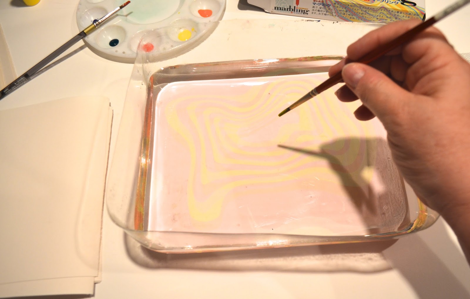
I am a relative newcomer to watercolor painting.
I spent most of my career working in acrylic, gouache and pen and ink.
But once I discovered this illusive medium I could not teach it to myself fast enough!
After many years working as a commercial artist and a visual art teacher
I began to take watercolor seriously in a small community college night class.

I hold a BFA in Illustration so of course watercolor and I crossed paths in college 
but it wasn't until that first little night class that somehow a spark developed.
What a ragtag group we were, a construction worker, a group of long retired ladies,
an accountant, stay at home moms and two impressive special needs adults.
Our teacher was a local artist, who honestly looked like she bit off more than she 
could chew with our group.  
But as the weeks went by I found a new passion and haven't looked back since.
When the class ended I studied watercolor magazines,
you tube videos and practiced through tons of trial and error.  

So you were expecting famous names from art history?
Of course painters such as Winslow Homer, John Signer Sargent,
Georgia O'keeffe,  and so on all come into play as I continue on this track.

However, as a Still Life painter, my absolute favorite contemporary artist is Janet Fish.
She is an oil painter but much of her working style lends itself very well to the study of watercolor.
I admire so much her study of light, mixtures of pattern on pattern and her glorious color.

Janet Fish, “Provence” (1995), oil on linen, 50 x 50 inches.

The following is from an essay titled "Janet Fish and the Primacy of Perception" by Patrick Neal

Other Modernist painters working within the still life genre and relying on visual perception, would explore equivocations in size, distance, matter, memory, and the metaphysics of objects. More straightforward in her approach, Janet Fish, known for her effulgent still-life paintings, paints with a sharp focus, her objects solidly planted in front of us.
Fish’s singular achievement is the depiction of light as a materializing force — particularly transparency in the form of colored glass. Over the years, she has explored the structural and expressive possibilities of spectral light on ordinary objects: blown glass, plastic bags and wrappers, flower petals, ribbon candy, gummy bears, fleshy fruits, etc. In fact, with their opulence and rich details, her works harken back even further to the excesses of Golden Age Dutch still-life painting. A work in the show like “Provence” from 1995 is a vintage Fish still life — a pattern of rock candy, glassware, and clear plastic in predominant yellow and pink hues.
Janet Fish, “Ice Cream Sundae” (2004), oil on canvas, 50 x 60 inches


But it all began for me in that little community college night class.

If you are not familiar with Janet Fish I am so happy to have introduced her to you.
And stop by the Patience Brewster website.
It will make you smile.


Related Posts Plugin for WordPress, Blogger...