I have had a few questions messaged to me asking about putting together a still life like this.
So read on to see how I approach a complicated set such as this.
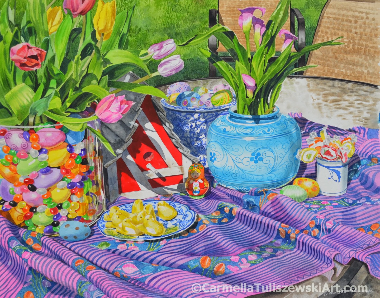
"Spring Sweets", Watercolor, 18" x 24"
©Carmella Tuliszewski 2014
COMPOSITION
In Still Life composition is especially important.
I do all my composing through the viewfinder of my camera.
Now that may not sound very creative to most who imagine artists wildly sketching off drawing after drawing to accomplish this. But, for me, since I set up all my Still Lifes with found objects,
that puts me in control as to how the objects relate to each other.
I often take many pictures from many points of view.
I then edit through iPhoto by cropping and angling until it just feels right.
The viewer may not even realize it but most artist will devise lead ins and focal points
to bring you into the picture and then keep you interested to look around.
In this piece, the rolls of fabric on the left bring you into the scene,
following it like a road to the large jelly bean jar.
You next are drawn to the red birdhouse following through to the brightly
painted lolly pops.
At least that's the way I hope the viewer sees it :)
COLOR
I enjoy keeping my hues bright.
I usually photograph set ups on sunny days because I love playing with the shadow coloring
and the way they connect the objects to other elements in the scene.
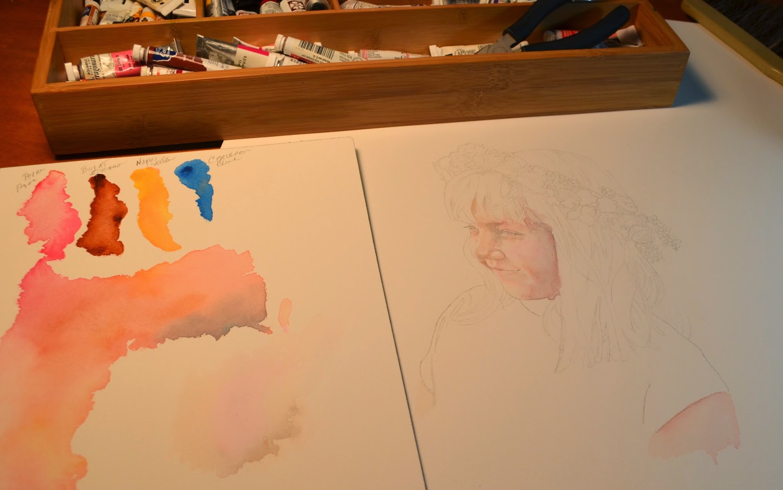
I have made charts of all the paints I currently have, adding more as another purchase is made.
I rarely use color straight from the tube but knowing what I have as
I work helps me make my choices for glazing and blending.
Watercolor dries lighter.
So a beautiful, rich color when it's wet and first painted on the paper soon disappears as it dries.
I find this one of the most challenging aspects of working in watercolor.
This is where glazing comes in. By laying in layers of the same color or building up with different colors in the same area, you will eventually reach that point of dark, richness you want.
Reds are particularly difficult.
I take a clue from artists like Van Gogh and other Impressionists and
Post Impressionts for cast shadows.
By using a comlpelemtary color to the object for its cast shadow mixed with maybe a Paynes Gray, your shadows will hold a connection to its object and ankor it to the scene.
This is also true for mixing shades.
I do use masking fluid, usually drawn in with a quill pen.
Although I am a pragmatist and will use spots of white paint when necessary,
It's always better to limit this to small accents or missed highlights.
CLARITY
Clarity, or the details, are possibly my favorite part of the process.
I am a realist painter because I really enjoy making it look as if you could imagine
popping one of those jelly beans in your mouth.
But I still like it to look like a watercolor painting so I stop at some point to let washes show a bit.
The details are about what you see and understanding how to model and form an object.
Pay attention to light sources and reflected and core shadows.
Again building up layers of "darkness" without going to far.
Good brushes make a world of difference when laying in details such as
the designs on the jars and cloth in this piece.
I work intuitively while handling all the above aspects of a painting.
But I also build these parts while using prior knowledge from years of study,
teaching and just plain hard work and practice.
I am not always successful but each painting makes the next painting better.